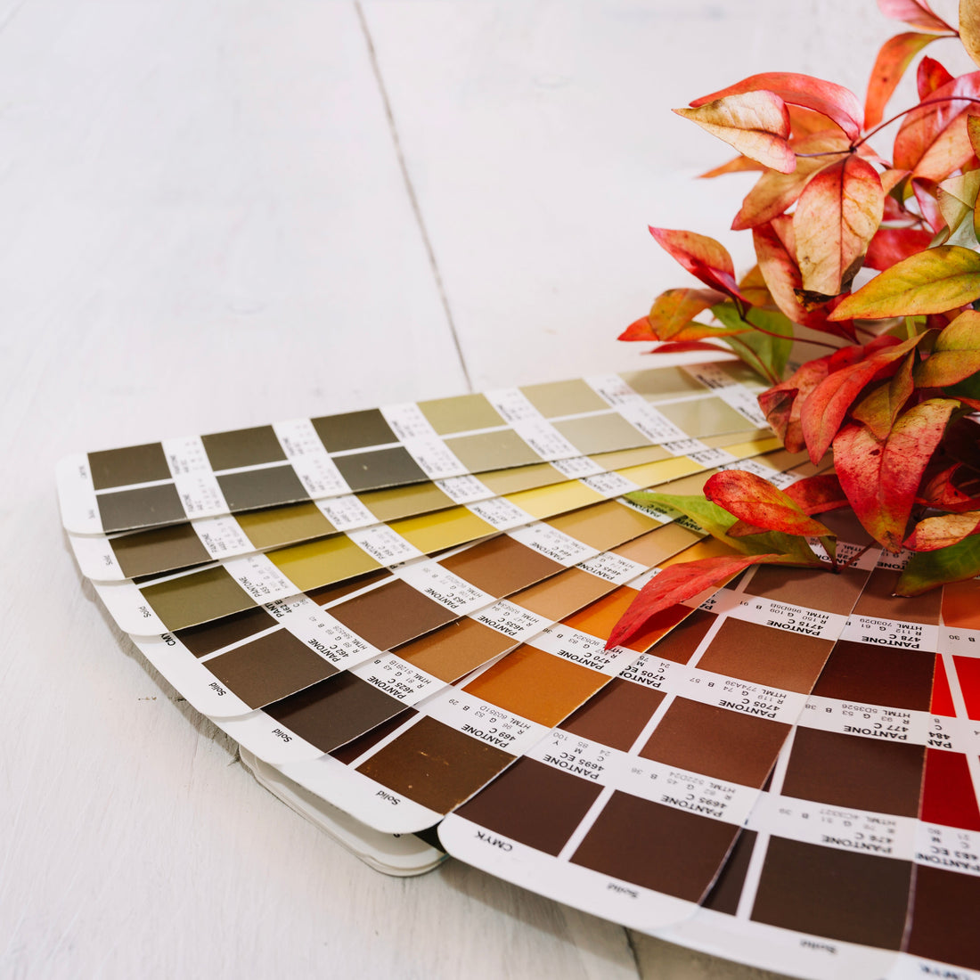
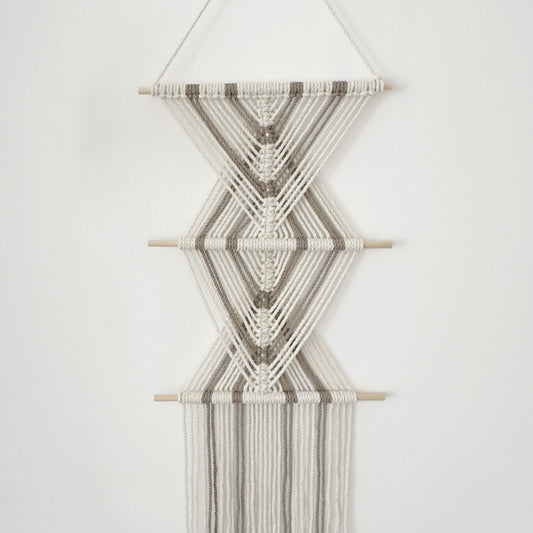
Which colors are best for your macrame? Here's how to choose wisely!

The colors you choose for your macrame will not only affect its visual appearance but also influence the ambiance of the space where it hangs. Just like furniture, lighting, and other artworks, macrame can be an element that conveys warmth, tranquility, drama, or energy. So how do you determine which color combination suits you best?
Why are colors so important?
Colors influence our emotions, whether we are aware of it or not. They can evoke feelings, create a sense of warmth or freshness, and define the character of a space. When choosing colors for your macrame, it's important to understand how they interact with other elements in your home to create a visually harmonious atmosphere.
Natural and soothing colors
If your goal is to maintain a soft, calm, and harmonious atmosphere in the space, natural colors are the perfect choice. Shades like beige, white, off-white, light brown, and olive green blend beautifully with Scandinavian, minimalist, and boho-chic design styles.
Benefits of natural colors:
- Bring warmth and tranquility to the space
- Create a harmonious and elegant look
- Suit a wide range of spaces and styles
- Timeless and provide a sense of classic refinement and cleanliness

Bold and dynamic colors
If you want to add a sense of boldness and energy to your space, consider choosing rich colors like terracotta, mustard, deep blue, burnt orange, or burgundy. These colors are great for creating striking focal points and giving your space a modern and impressive look.
Who is it suitable for?
- For spaces that need a touch of color and dynamism
- For those who love eclectic, modern, or boho designs with a twist
- For anyone looking to add a unique character to their home
- For neutral-toned spaces that need a pop of color and vibrancy

Winning color combinations
If you're unsure about which colors to choose and want to create a harmonious combination, here are some pairings that always work:
1. Beige + Olive Green + Brown – Natural and soft, adds warmth.

2. Light Gray + Deep Blue – Elegant and sophisticated, perfect for modern spaces.

3. Mustard + Terracotta + Cream – Warm and cozy, perfect for a relaxed atmosphere.

4. Black + White + Natural Wood – A classic combination with a modern touch.

Matching Colors to Your Home
To ensure that your macrame blends seamlessly with the other elements in your home, consider the room’s size, lighting, and existing colors:
- For bright and spacious areas – Light colors and earthy tones are a perfect fit.
- For small spaces – Avoid overly dark colors and opt for soft or monochromatic shades.
- If you have colorful walls – Choose a macrame color that complements rather than competes with them.
- For those who frequently change their decor – Neutral colors are the best choice as they adapt easily to different styles.
- For rooms with low lighting – Lighter shades help brighten the space and create a more open feel.

Tips for Choosing the Right Colors for You
Draw inspiration from nature – Natural colors like sand, wood, or green foliage create a calming atmosphere and connect you to nature.
Use an existing color palette – Look at your furniture, walls, and home accessories to choose a macrame that complements them.
Match colors to your personality – Colors reflect character! If you prefer a quiet, minimalist style, go for natural tones. If you're drawn to boldness and uniqueness, opt for vibrant colors.
Test with fabric samples – Before purchasing your macrame, place fabric swatches in your chosen colors next to your furniture and walls to see how they blend.
Which color combination speaks to you the most?
If you're unsure, I'm here to help you choose the perfect macrame for your space!
For a custom wall macrame and to get in touch, click here!


